Introducing The New Brand Identity for the Regenerative Marketing Movement
A fresh look for the evolving movement
We are excited to share that the Movement has undergone a rebranding process. Over the past few months, we've worked diligently with the talented designer Fleur Augustinus to develop a brand identity that reflects our mission and values.
Why the Rebrand?
As the movement has grown, it became clear that the brand (which we originally created on Canva) needed to evolve to better convey the vibrant and dynamic nature of regenerative marketing. We sought an identity that would not only capture the essence of our mission but also inspire and attract a diverse community of creative professionals dedicated to making a positive impact with their skills and experience.
Key Elements of the New Brand Identity
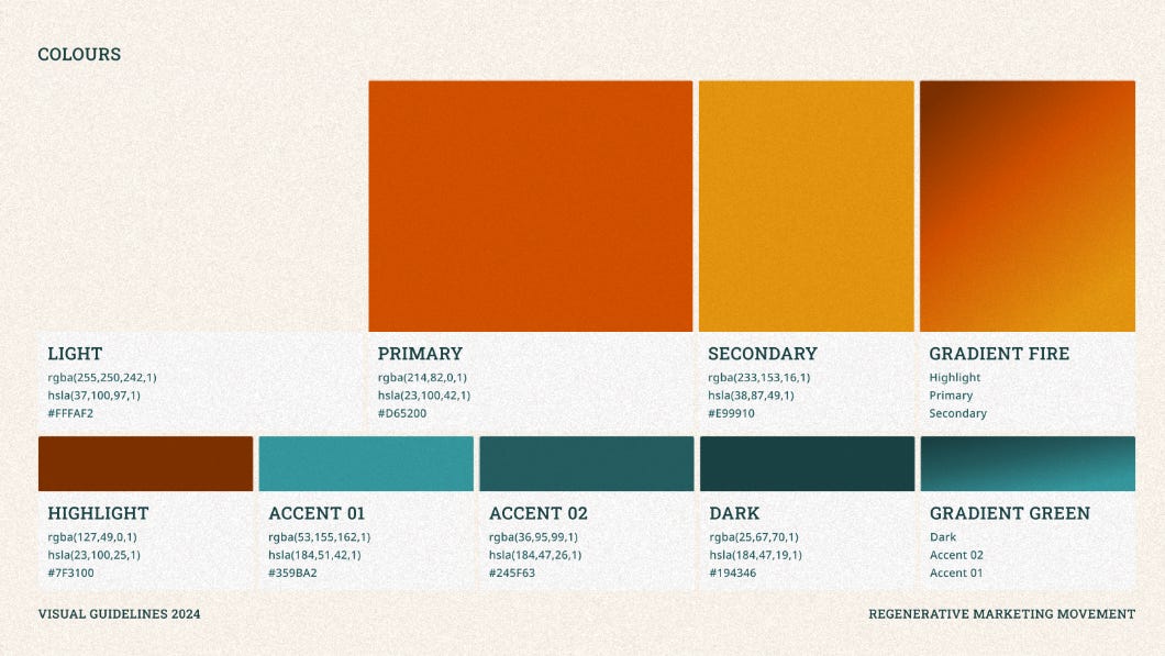
Vibrant Colors: Moving away from the traditional greens and beiges often associated with environmental brands, our new palette is bold and bright. These colors symbolise the energy and creativity that drive the regenerative marketing movement, and are inspired by the diverse colours of the natural environment.
Playful Design: Incorporating doodles and sketches, our new visual language reflects a continuous state of ideation and innovation. It’s a nod to the draft mode of creative processes, highlighting our commitment to ongoing improvement and adaptability.
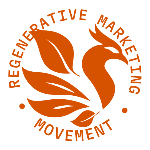
Nature-Inspired Imagery: At the heart of our new logo is the phoenix, a powerful symbol of rebirth and transformation. This aligns perfectly with our mission to rise from the ashes of unsustainable practices and create a better future through regenerative marketing.
Fleur's Vision for the New Brand
Fleur's vision for the new brand identity was to create something that not only stands out but also resonates deeply with the creative minds within our community. Here are some key aspects of her vision:
Inclusivity and Creativity: Fleur aimed to develop a brand that is inclusive and appeals to a wide range of creative professionals. By using bright and diverse colors, she wanted to create a sense of excitement and energy that would attract innovative thinkers.
Fun and Accessibility: The use of playful elements like doodles and sketches was intentional to keep the brand approachable and fun. Fleur believes that serious topics, like sustainability, can and should be communicated in a way that is engaging and accessible.
Symbolism and Storytelling: The phoenix in our logo is more than just a design element; it tells a story of renewal and hope. Fleur wanted the brand to convey a strong narrative that would inspire and mobilize our community towards collective action.
What Fleur Hopes to Achieve
Fleur hopes that the new brand identity will achieve several key objectives:
Attract Creative Minds: By breaking away from the conventional environmental brand colors, the new vibrant palette is designed to catch the eye of creative professionals who are looking for something different and meaningful.
Stimulate Innovation: The playful and informal design elements are meant to spark creativity and innovation. Fleur believes that a fun and dynamic brand can stimulate new ideas and approaches to regenerative marketing.
Build a Strong Community: The new identity aims to foster a sense of belonging and community among our members. By making the brand more visually engaging and relatable, Fleur hopes to strengthen the connection between the movement and its supporters.
Explore the New Brand Assets
We are excited to share the visual elements of our new brand identity. Below are some of the key assets that Fleur has created:
Logo Variations:


Color Palette:
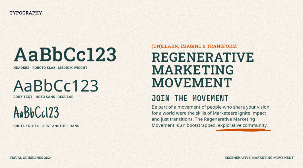
Typography:
Design Elements:


These assets showcase the vibrant, playful, and nature-inspired approach that Fleur has taken in reimagining our brand. Each element has been thoughtfully designed to align with our mission and vision.
The Design Process
Our collaboration with Fleur was a journey of co-creation and discovery. Despite time constraints and the challenges of working within a volunteer framework, Fleur's flexibility and creativity were instrumental in bringing this vision to life. The new brand identity is not just a visual overhaul but a strategic alignment with our core values and the needs of our community.
What’s Next?
With this new identity, we aim to make the Regenerative Marketing Movement more accessible and engaging for our current members and attract new supporters who are passionate about regeneration and reimagining the role that marketing plays in society. We believe that this fresh, energetic look will help us better communicate our mission and inspire more individuals to join us in making a difference.
Join the Conversation
We invite you to explore our new brand identity and share your thoughts with us. Your feedback is invaluable as we continue to evolve and grow. You can listen to the full podcast with Fleur Augustinus to gain deeper insights into the rebranding process and the inspiration behind it.
Listen to the Podcast Below —>
Connect with Fleur
If you’d like to learn more about Fleur Augustinus and her work, you can connect with her on LinkedIn. Her expertise and passion for design are truly inspiring, and we are grateful for her contribution to our movement.


